Throughout our project media technologies have been extremley important in helping us to develop our ideas and to create what we wanted to achieve. The blog format has been very useful because we have been able to keep track of the rearch we have made and to evaluate out ideas. It has helped to keep our work in organised state so that we can keep refering back to points that we have made and then devloping things from there. Furthermore this format allows us to copy in pictures, videos and screen grabs to link all our ideas together. It does have some weaknesses in the way that we can only use a digita tetxt and stops us from showing skills through texture and the written form, however images and text can be scanned in to the blog and pasted in. It did allow us to conduct our planning and research more effectivley because it keeps it organised, it also helped greatly with our textual analysis because we were able to click back to the you tube video with just one click.  As shown below we were also able to create our own you tube page which allowed us to upload our videos at different stages of the editing process and aqquire added audience feedback. This was hugely valuable because it meant we were able to use another technology making the process easier and more professional. Click to access our you tube page.
  The internet is a very valuable resource for us in our research stages because we can look at and analyse videos on youtube or look at album covers on google. It means that we can access any information that we want. We have also been able to look at statistics and websites to increase our knowledge of music videos. The internet has also allowed us to create our own youtube site which we have uploade videos, giving us another way og gaining audience feedback. The editing and filming stages of our process have been made much easier by the software we have been able to access. The final cut express software on the Mac computers is very easy to use yet we have been able to experiment and achieve some really effectove results. This has meant that we have no limit to the ideas we can process into actual work. The video equipment is also simple and easy to use and we have experimented with thye tripods to achieve a range of shots and angles. The software has then meant that even with a low quality range of footage we were able to develop it and edit it to achive amazing results. Final cut express and imovie have allowed us to upload videos with a click of a button and change their format so that they can be uploaded too. We have found final cut easy to use and having npot used this program before we picked it up easily and have been able to play around with techniques to achieve amazing results. The process of using these technologies was quite easy to use and once we were accustomed to it it was quite straight foward. We also used th internet to find out how to create certain effects and make the video the highest quality we could.
Final cut allowed us to create a range of techniques and be adventurous in what results we could achieve. One of the main things that we had decided in the planning stages of creating the video was that we wanted to edit some shots by changing the colour to give them red and pink tones, we felt this would emphasise the femininity and desire of the woman, reinforcing the idea of the main character being a prostitute. As the picture below shows we achieved this quite well and it gave the shot an aged look. This along with some sepia camera effects made the video have a variety and keep the viewer interested. When planning the video we knew that although we wanted a narrative we wanted the audience to create a narrative for themselves. By using certain techniques and editing it enhanced their ideas and reinforced what they already think about the girl and about what is happening to her.
We had also decided that we wanted to give the video quite an abstract, arty edge to it to give an interest and to allow us to play around with the techniques and effects we could achieve. We used a spiral/kaleidoscope effect on this sequence, it shows how her life is spiraling out of control.


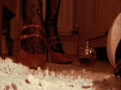
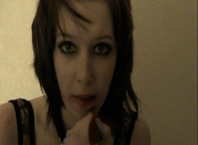
 The images used in our advert were screen shots of the music video as an unfinished product, as we wanted to put something more into our video, without giving too much away in our ancillary tasks, so therefore we chose to leave the last bit of filming out. The image used in our cd cover was also taken whilst filming our first part of the music video. This means that in concern of images, they are all correlated. The types of fonts we decided to use were on the fireworks program, as we found that finding a font from the internet that would match which we wanted, which would be to be simple and classic, was very difficult to cut out the background and insert it, especially when we had alot of writing to place on the CD cover in loads of different places. Therefore we came to a group decision of a classic font which we thought suited the choice of song and the label we wanted to create for it. This font was then used on the advert and also the CD cover/digipak. This was to ensure that they matched eachother in concern of the style we chose.
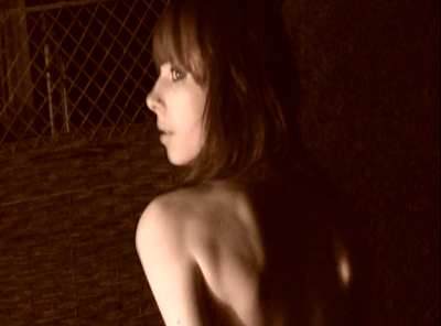
 Overall we found that the audience thought the video portrayed the feeling of being lonley and sad, through the use of only one person. As we have previously stated in our research we wanted the stereotype of a prostitute to be clear to the audience but then because there is a lack of narrative it allows themto build the story for themselves. All the results show that we were successful in creating this stereotype and allowing the audeince to decide why she feels lonley and what she is going through. Our results also show that were successful in our whole editing process and that the techniques we used (adjustment of colour, speed) all added to the mood and mise en scene of the video.


