Wednesday 31 March 2010

How did you use media technologies in the construction and research, planning and evaluation stages?

Throughout our project media technologies have been extremley important in helping us to develop our ideas and to create what we wanted to achieve. The blog format has been very useful because we have been able to keep track of the rearch we have made and to evaluate out ideas. It has helped to keep our work in organised state so that we can keep refering back to points that we have made and then devloping things from there. Furthermore this format allows us to copy in pictures, videos and screen grabs to link all our ideas together. It does have some weaknesses in the way that we can only use a digita tetxt and stops us from showing skills through texture and the written form, however images and text can be scanned in to the blog and pasted in. It did allow us to conduct our planning and research more effectivley because it keeps it organised, it also helped greatly with our textual analysis because we were able to click back to the you tube video with just one click. As shown below we were also able to create our own you tube page which allowed us to upload our videos at different stages of the editing process and aqquire added audience feedback. This was hugely valuable because it meant we were able to use another technology making the process easier and more professional. Click to access our you tube page. The internet is a very valuable resource for us in our research stages because we can look at and analyse videos on youtube or look at album covers on google. It means that we can access any information that we want. We have also been able to look at statistics and websites to increase our knowledge of music videos. The internet has also allowed us to create our own youtube site which we have uploade videos, giving us another way og gaining audience feedback. The editing and filming stages of our process have been made much easier by the software we have been able to access. The final cut express software on the Mac computers is very easy to use yet we have been able to experiment and achieve some really effectove results. This has meant that we have no limit to the ideas we can process into actual work. The video equipment is also simple and easy to use and we have experimented with thye tripods to achieve a range of shots and angles. The software has then meant that even with a low quality range of footage we were able to develop it and edit it to achive amazing results. Final cut express and imovie have allowed us to upload videos with a click of a button and change their format so that they can be uploaded too. We have found final cut easy to use and having npot used this program before we picked it up easily and have been able to play around with techniques to achieve amazing results. The process of using these technologies was quite easy to use and once we were accustomed to it it was quite straight foward. We also used th internet to find out how to create certain effects and make the video the highest quality we could.


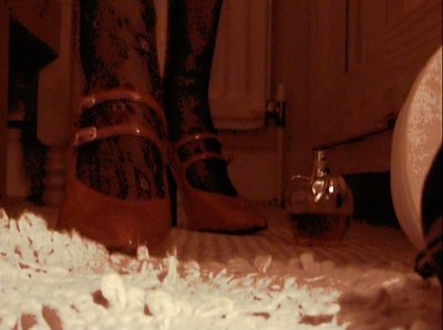
Final cut allowed us to create a range of techniques and be adventurous in what results we could achieve. One of the main things that we had decided in the planning stages of creating the video was that we wanted to edit some shots by changing the colour to give them red and pink tones, we felt this would emphasise the femininity and desire of the woman, reinforcing the idea of the main character being a prostitute. As the picture below shows we achieved this quite well and it gave the shot an aged look. This along with some sepia camera effects made the video have a variety and keep the viewer interested. When planning the video we knew that although we wanted a narrative we wanted the audience to create a narrative for themselves. By using certain techniques and editing it enhanced their ideas and reinforced what they already think about the girl and about what is happening to her.


We had also decided that we wanted to give the video quite an abstract, arty edge to it to give an interest and to allow us to play around with the techniques and effects we could achieve. We used a spiral/kaleidoscope effect on this sequence, it shows how her life is spiraling out of control.


Tuesday 30 March 2010

How effective is the combination of your main product and ancillary texts?

The colours we chose to emphasise in our video are reds and pinky tones, this was also present in our ancilary tasks of red and pink to make it a common occurance and also to make sure they were correctly related. The effects of the red and pinky tones were so that the audience would make a relation between this and could start to decode the meaning of the video, without seeing it. Red represents lust, sex, danger, and also has relation to the red light district (our actress is a prostitute), and the tradition of a prostitute having a red light on in her room. The colour pink is used to emphasise romance, love, feeling, and femininity, which emphasises the other part of our video, as she is in a dream. These colours are present in all of our ancillary tasks, and are the main emphasis of our products in concern of colours: This then helps to add to the brand identity of our products. 

The images used in our advert were screen shots of the music video as an unfinished product, as we wanted to put something more into our video, without giving too much away in our ancillary tasks, so therefore we chose to leave the last bit of filming out. The image used in our cd cover was also taken whilst filming our first part of the music video. This means that in concern of images, they are all correlated. The types of fonts we decided to use were on the fireworks program, as we found that finding a font from the internet that would match which we wanted, which would be to be simple and classic, was very difficult to cut out the background and insert it, especially when we had alot of writing to place on the CD cover in loads of different places. Therefore we came to a group decision of a classic font which we thought suited the choice of song and the label we wanted to create for it. This font was then used on the advert and also the CD cover/digipak. This was to ensure that they matched eachother in concern of the style we chose.
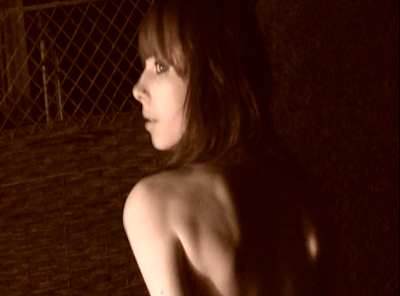
The brand identity we as a team beleive we have created for our pieces is artistic, as they match our artistic needs and our expectations. We made sure we were able to use some of our artistic skills, and make it classy and edgy aswell as being contraversial, outlining a different subject to most music videos. (we wanted ours to be a little like this, in concern of style, but less in your face) This would mean our intended effect would be to match the song with the ancillary products and also main product, in concern of the mood they set and the meanings that they represent, using the colours and fonts this was how we did it, also interlinking pictures from our video so that the audience is aware of the main character and it being about her life.


The package as a whole has the same font, colour scheme and stylised layouts, so it could be said that they all interlink with eachother and match eachother's profiles. The target audience would be one of which is interested in alternative music, and has similar a similar interest in art. The age can vary depending on how each audience decodes the meaning of the products, for example, some (such as younger people) may have a sympathetic view on our character, whereas an older audience may feel as though she is to blame for her ways, but this is due to individual differences and people will claim from the products what they please, and may have our intended effect, or may rebel against this. The products would be placed in upcoming and cultural places, such as the cultural capital of Liverpool/ cultural quater of S-O-T, Manchester, London, based around arena's and band venues, which is aimed at the main audience. Adverts could also be seen on websites related to festival/concert/gig searchs. The video would be seen on music channels such as Q, KERRANG!, Scuzz, and others, depending on which audiences like the song best, as recently many indie type musics are being recognised by institutions such as MTV.

Sunday 14 March 2010

In what ways does your media product use, develep or challenge forms and conventions of real media products?


At the beginning of our coursework, we wanted to create something that enabled people to make their own assumptions from our media product (the video)
 using their own thoughts and their own experiences. From that, we needed a brief storyline and narrative, in order to not outline it bluntly to our consumers. From this, we also didn't want to make the narrative too clear, so we decided to not make the obvious obvious. Our storyline was a prostitute/escort, who was alone and stuck in a cycle of routine and loneliness. We decided upon this after choosing our song, which was something we both really liked, and were familiar with, also something we beleive that the video didn't match the so
ng aswell as it could have done (click to view video).


Using existing videos and looking at artists that were based in a similar genr
e, we textually analysed them to see what narrative, mise en scene and editing techniques they used. The plain white t's, hey there delilah has a similar song, as it is acoustic, so we anaylsed the video and decided to make our mise-en-scene simmilar, by using simple colours and soft lighting to make things look subtle and to create a calm atmosphere. This can also be seen in Coldplay's video Fix You. Our media product (video) resembles these forms in the ways of mise-en-scene, but also develops them as it uses different sets of mise-en-scenes, as we have 3 different locations, unlike the video listed above, of which one, has one location.

The types of camera work we used enabled us to develop existing ones and also use similar ones that we thought were particulary effective in order to understand our product. Close ups were a common occurance, which meant the audience could clearly see the actress and using Dyer's theory of stereotypes, they will decode the meaning of our music video, understanding then that the actress is a prostitute. The editing we used needed to be similar to that of existing ones, so that the audience was able to decode the meaning of the editing techniques we used. We used a sepia effect :
to show the past tense of a dream, and also made this sharper to make it more outstanding, compared to our other content. We also made an emphasis onto the colour red,
as red represents lust, danger and sex, going with the red light district, and also the tradition of a red light being on in a prostitutes room. This colour red also helps the audience to decode the story of our intended, more than any other colour.

Andrew Goodwin's theory states a number of key features which distinguish the music video as a form. A relationship between the visuals and the lyrics is shown, as the lyrics resemble a lonely person's life, and how it's "not good enough for me, no.", and the visuals show a lonely life of a prostitute, they amplify eachother. The second feature is that genre's ar
e complex and diverse in terms of music video style and iconography, the genre to be decoded needs the audiences' social and cultural experiences, meaning the story may be differently understood by different types of audiences, however, certain aspects such as the costumes and props make emphasis on our main character. For example what the character wears is an icon to what she is. The third aspect is that record companies will demand a lot of close-ups: 
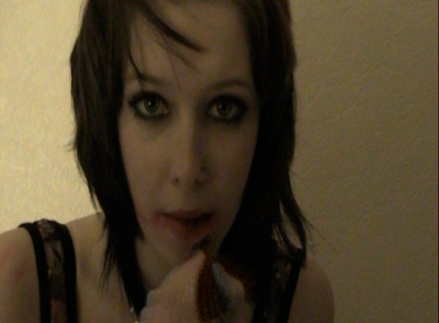
of the main artist or vocalist. However, because we didn't use the artist in our music video, as the song is quite emotional, we beleived it would be extremely cheesy and would label our music video as not artistic and different, this is why we chose to use an actress which had no relevance with the artist himself, as they are totally different. Instead we used close ups on the main character as shown in the picture above, this helps the audience identify her. 

In conclusion, different social and cultural experiences mean that they will decode our storyline and narrative differently to others and therefore the music video will be a different experience for different people. Our choice was that our music video represented the song, but also was quite controversial in concern of social context, as we wanted to create something that people wouldn't be used to seeing, but using editing techniques and such in order for the audience to understand.

What have you learned from your audience feedback?


Audience feedback is hugely important to our video because it can help us to improve it to meet the audiences needs. After doing our first inital cut we showed the video to our audience to see what their initial thoughts were and how we needed to change the video. Our first feedback was that the video lacked a narrative and needed to have more of a story to keep them gripped. We then were able to go out and film more footage in a different location to achieve a higher standard of video. We felt that by acquiring audience feedback we were able to analyse what the video was missing and how it could be improved. In general audience feedback is how every media producer survives because it can only improve the video and result in more money being made. 

After devising a questionnaire we were able to find out what effect our video had on a wide audience. We have collated the results so that we can analyse them and see what parts were successful and not. We wanted to ask the audience how successful they thought the overall video was and what feelings they felt towards the girl as well as what they felt she was feeling. We also asked the audience what improvements they would make to the video to make it more successful. 

Overall we found that the audience thought the video portrayed the feeling of being lonley and sad, through the use of only one person. As we have previously stated in our research we wanted the stereotype of a prostitute to be clear to the audience but then because there is a lack of narrative it allows themto build the story for themselves. All the results show that we were successful in creating this stereotype and allowing the audeince to decide why she feels lonley and what she is going through. Our results also show that were successful in our whole editing process and that the techniques we used (adjustment of colour, speed) all added to the mood and mise en scene of the video.


However our results also show that we could make improvements on creating a clearer narrative. We feel this could be because the audience wants to be able to understand her story better. Through our planning stages we had discussed what the narrative would be and how we didn't want it to be too clear to the audience. We wanted to use Barthes action code, in which we expexted the audience to create meaning through the use of clever mise en scene. Also linking to his enigma code in which we wanted the audience to ask questions of the narrative so that they could decide what was going on in the video. This can be seen in videos such as the plain white tees-Hey there delilah.


The costumes and props in the video become hugely important because they create an idea of a stereotype similar to Dyers theory suggesting that stereotypes reinforce the idea that there are big differences between people. This is true for out video becasue the girl is not relateable she is different to many people. However the emotions and the flow of the song make it easier for the audience to understand and empathise with her feelings of abandonment and lonlieness.
The main need that we satisfied within the audience is of the woman being the visual pleasure and resulting in the object of the male gaze. Mulvey suggests that film always produces a woman that is "to be looked at". This is true for our video not only because of the provocative clothing that the main character wears but also because she is the only person in the video it makes sure that the audiences full attention is on only the girl and nothing else. our feedback shows that we were successful in showing this because the audience felt that they understood she was a prositute and that the mise en scene and costumes were successul in guiding their attention to her.

Thursday 11 March 2010

Final Pieces

Here is also a link to out page on you tube and the final piece is also posted onto there too. 

Here is our final cd cover: 


Here is Our Final Advert:


Monday 1 March 2010

Magazine Advert Analysis

Compared to the rest of our magazine advertisements, this was our shortest and most contrasting. A new and upcoming artist, who has shown her face and name to make sure people will recognise her in the future, as she hasn't already got a reputation in the music industry to the public. The colours are bright and eye catching, in order to stand out and catch the attention. It is still kept simple, so the public doesn't have to take too much into account and be confused as to what the advert is meant to be doing.
The colours used in this advert are quite simple, but as they used the black, it stands out and grabs the reader's attention. The logo is central and controversial, adding to grab the reader's attention. The artist's aren't shown on this advert, which shows the reader that their reputation is already formed, and the reader should already be in acquaintance with them and their music. 


This artist's reputation has already been profound, however, as she is still an upcoming, new artist, she still wants the public to know who she is and what she represents. By showing calm colours and a photo of herself to emphasise her reputation and aura. The colours used are related to the indie music crowd, which Florence and the Machine is a part of. The photo is central which is the first place where the consumer looks, with a bizarre photo, that will grab further attention. 


Saturday 27 February 2010

Ancillary tasks

Magazine Advertisement
We have allocated shots from our music video to use in our magazine advertisement as a design feature, to show the music video more indepthly, and also to make them artistic and relative to eachother. We have put them in a grid shape along the page, to fill the page. We decided upon this as we wanted to make something a little different to the magazine advertisements that we'd already seen and analysed, and also other members of our class. Using fireworks on our apple computors we were limited in concern of knowledge and how to use the program, despite having background knowledge from our chosen route last year. We decided that the website we used for font was too complicated, and we couldn't figure out how to cut the text and put it on the advertisement without the whitebackground. After looking on fireworks, we found that it had many fonts available that went with our simple theme, so we used this for fonts.We wanted to keep the colours the same as our mise-en-scene choice in our music video, so that they relate to eachother and you can tell that the advertisement is advertising that music video, due to that. Because of this decision, we chose the shots from our videos, which had a soft tone with certain colours such as red standing out, and also kept the colour of our font, as well as the style of our font, soft and simple, using colours such as creams.

Digipak CD case
For our digipak we wanted to create something artistic that would accompany our talents. We decided that we wanted to explore different ranges of media by sewing and using printed pictures, so we would scan the final piece into the computor for the blog. We looked at the artist's own cd covers here and here to see the image what he went for. We then thought that these were too simple to accompany our video, as it is quite contraversial, and wanted to create something that went well with our video and the song. We decided to use photo's that we got from our first filming shoot, and then sew over them to create texture and ensure it doesn't look "flat". For the front, we wanted to use the same text as we did on our advert, but emphasise colours such as pink and red, which are apparant on the photo. We used red thread to stitch into the photo and used a dark red colour for the font. For the back we used lipstick to make kiss marks on some fabric and sewed through the back to create texture. The text we wanted to be small and central and the same colour as what we used on the front. We scanned these into the computor and created our final digipak which we have shown further in the posts.

Final Filming

After waiting for a camera to become free, we can finally film the last part of our music video. We have discussed filming one part in the day time and one part in the evening, and have found this will be too difficult as our deadline is approaching quickly. So to sort out the problem, we are going to be filming both of our next parts in the day time, one in the woods (carrying on the fairytale/dream theme) and the other in the alleyway (carrying on the prostitute/waiting for someone theme). Our filming date is the 28th February 2010, with the mise-en-scene carefully managed by being away from public influence, one location being in a local woods, and another location in the alleyway next to the actress's house. We will only have certain props such as cigarettes for the alleyway part, and a peice of cloth for the woods part of our filming. The clothes she will be wearing will be the same in the dream part, to emphasise the repetition of her life, she keeps dreaming the same thing, she only dreams of that thing. Her clothing in the alleyway will be similar to our first set of filming, however we decided they were abit too revealing to be wearing outside the house, we are still going to give her a "trashy" sort of look, but with more clothes and a leather jacket or fur coat, in which we shall decide when filming.

After publishing this post, we had difficulties getting hold of our actress, and this gave us great difficulties as we had a deadline close. We decided as a group to use ourselves but to carry on our theme and to ensure the grade we believe we are possible of, we would not show the head of the actress, and instead just use the legs and emphasise the "prostitute" theme. We planned 

Monday 22 February 2010

Ancillary Tasks

We need to plan the digipack for our CD and DVD pack. For this, we have found a template off the internet to hold 2 CD/DVD's. We decided that our digipack and cover will reflect the artist and the controversy of our final music video. This meant that we would use simple fonts and subtle colours with emphasis to certain ones such as the colour red, which we have shown in our music video. 
To help us decide which fonts are best we used this website, we had already minimised the fonts to which we want, using the word simple to go with our theme. The colours we will be using will also need to go with the theme of our video. To match our mise-en-scene we decided to use pale mono-tones with the emphasis of the colour red, to make it stand out. The colour red represents feelings such as lust, anger and passion. For example, we have edited this photo to show how we want to emphasise the colour red on her lips, to show her provocative behaviour. 

Tuesday 9 February 2010

Our progress

After having feedback from our peers of our final cut. We decided that we needed more footage to make sure that we obtain the best grade that we are capable of, and also so that our music video can be memorable and alternative to others. We have had a brainstorm and come up with more ideas to add to our existing footage. Other locations consist of in an alleyway to give the video more of a repetitive narrative, (the prostitute narrative). We will show our actress in a variation of camera angles from her slouching, to lighting up a cigarette, to standing and looking at her watch. This will be used to emphasise the feeling of her waiting for someone. Whoever that may be is up to the audience to decide. We wanted to add to the emphasis of repetition by using a number of different alleyways, if we could make this possible.

 The second location we decided was in a woods. This was to add to the juxtaposition of the "prostitute" scenes, to the dream world. We filmed our dream world in the dark last time, and this time we decided we wanted more of a contrast to the prostitute scenes, and plan to film in the day time to make it more clear. We will also use a various number of angle shots such as ariel shots, low angle shots, floor shots, over the shoulder shots and point of view shots. 

Certain props that we need will be the material we used in the first scenes of the dream world, this is just to add to the effect of her dreaming and it being abnormal and extravert. We will use similar clothes to the existing shots to emphasise this dream world, and to make it like a "fairytale", adding more of a narrative. Our theme is repetition, to show the actress's daily life, and the life that she aspires but will never be apart of.

In the alleyway, we will be using similar clothes to our previous footage, to show that she is a prostitute, without giving too much away. We didn't want to show her waiting on a street corner, as this will label our video as obvious and "tacky". So instead using the mise-en-scene such as her clothes, location and her mannerisms to emphasise who she is. We will be filming in the dark, and outside, to contrast from being inside and the dream, but still creating a similar mise-en-scene. To help with the lighting, as we found it difficult when filming outside in the dark, we will need a bright light such as a lantern or a lamp. This will add to our mise-en-scene and make it as perfect as we can get it. We are excited to get started on the next part of our filming. 

Wednesday 3 February 2010

Magazine advertisement analysis

In order for our research and planning to guarantee us the grade we want, we need to do further research into our ancillary tasks. As part of last year we did a magazine front cover, contents page and double page spread, we decided to look on our blog from last year to see what progress we made and what textual analysis we conducted, on which magazines. This helped us a little bit, but we need to be more precise, for example, we looked at front pages, we now need to look at music advertisements. For help with our research, we are going to buy some magazines and textual analyse the magazine advertisements we can find. However we know that these are limited in certain magazines, and music magazines will be our best option. 
For our second part of our ancillary tasks, we need to create an album cover for our chosen song and artist. For research into this part,


Thursday 21 January 2010

Our Progress

We have completed our final cut after completing more filming and adding this to our other material. We feel the contrast between the two locations and the two ideas (feminism versus sexism) has been proved successful. After using a number of different techniques such as editing the speed and brightness and contrast of the colour, it gives the vibes of a professional final piece. However we still feel there are a few tweaks we still need to make, as our aim of making the shots black and white, enhancing the colour has changed. We don't feel like this will reflect our good set of mise-en-scene. We wanted to enhance the red colour on the lipstick, but haven't found a way to do this yet. So for now, we are looking for techniques in order to make this happen. We believe this will finish the video off perfectly and ensure us the marks we want. 

Now we have to complete our ancillary tasks and complete planning for our music video and make it as good as we will be able to. This is our next step.

Wednesday 13 January 2010

Textual Analysis

After analyzing our first cut we have decided to add in another location which will create a juxta position of the prostitute and lonely lifestyle against a dream fantasy world. 
As an inspiration towards our second idea  we have decided to look at florence and the machine's- Rabbit heart(raise it up).

The video uses soft colors and lighting to create a pretty result. The overall effect creates a "dream" like world which is emphasized by the blur effect that is used in the editing process. The shots used are not too short and linger on her. Furthermore the close ups make the audience aware of her reactions and the mise en scene created with her pretty makeup.
An effect is also used with the lighting where a light and mirror is used to reflect onto the actress and create a aesthetically pleasing result. 


Monday 11 January 2010

Research into producing our ancillary tasks

For the other part of our year 13 media coursework, we are hoping to produce a magazine advertisement and CD cover to go with our music video. During filming we took some photos to go with our mise-en-scene, however we wanted to keep the reputation of the artist but show that the cover/advert model, isn't the artist, as shown in the video. This further enhances our idea of fashion versus art, the contrast between the model and the singer's emotions. We realise we need to look at magazine advertisements, and album covers and textual analyse them, breaking them down to what is influential about each media product, and what makes you want to view/buy the CD. This will include the mise-en-scene, typography, colours, framing and quality. 


Thursday 7 January 2010

Next planning stage

We have decided that the next step to improve our mark, will be to film more footage of a juxtaposition compared to the previous footage that we have. We decided this because despite the huge amount and varied footage that we had wasn't interesting and as exciting as we hoped. However, because we want to make sure our mise-en-scene is perfect, as we feel it already has been, we need to carefully plan where our extra footage will be and what exactly will be in it. To make sure that we didn't have a huge contrast in mise-en-scene, we chose to keep the cool lighting and how we would do this would be to stay outside, so that we can control our mise-en-scene. We wanted to keep away from any external influences, such as cars and buildings too. Using this filming to be apart of the actor's dream world as the storyboard. Her outfit would need to be changed as we felt the one outfit was quite limiting to us and what we wanted to show. In order to create this dreamworld of "flashbacks" we needed to change the outfit to give a different mood and feeling to the atmosphere. 

Wednesday 6 January 2010

Our Progress

We have currently filmed our first rough cut and edited it to the song. We found we were quite comfortable filming and were able to work with the camera creating different shots. Our storyboards and planning were key in making the filming a smooth process as we referred back to them to check that we had the correct footage and angles. 

After reviewing all our shots and editing them our mise en scene is exactly the scene that we wanted to create and reflects the mood and emotions of the prostitute.  By using dull lighting and dull colors we were able to show the loneliness and sadness that she feels. We also used the color red to show the fieriness and passion that is hidden within her. The clothes and dressing of the room make it appear as though she has little money and show that she is a prostitute. We also think that our choice in actor was also very successful because she has a versatile look and we were able to dress her in the way we thought fitted in with the mise en scene. She will also fit well with our next filming because we can change her look to create this other juxta position. 
 
However we have decided that to make our video more interesting and to create a juxta position we need to film some footage in another location to show perhaps the girl in another life or situation. This would further grab the viewers attention and keep them interested because at the moment the video is good but it lacks a real story. 
It has helped to discuss and show our video to other people and peers to be able to assess the video from other eyes. By evaluating our work we are able to see what improvements need to be made. The main point that people picked up on was the lack of story, although our editing and current progress is good we need to aim to improve and tweak all the final bits. 

Rough cut:

Monday 14 December 2009

Storyboards

As our ideas and concept has developed we have altered and changed the shots that we wanted in the final video. This has meant that the music video will not follow exactly how we planned in our original storyborads. Howvere we feel that because we have incorporated our original ideas with the new they have created a more successsful result.
Currently we are editing the first set of film that we have taken. The editing process is where we are now changing and adapting how the final outcome will be. This is where we can change the colours and speeds of the shots to give the alternative result we are after.


Here are our original storyboards:


Monday 7 December 2009

Dates of shooting/editing and deadlines.

At present most of our research is complete and up to date, we have organised our shot list, risk assessment, story boards, actors, date and time of filming and prop/location. This means that we are ready to film. Our chosen time to film is at night to add to the feeling of loneliness, and add to the dark, mysterious character that our actor is portraying. The date is 7th December, we plan to film tonight and have our rough cut complete by the 18th December, we hope before. 

21st January 2010.
We evaluated where we wanted to go from this date, we found that we did have our rough cut completed before christmas (the 18th December). However after working towards our final cut, we believe we needed more footage to ensure our aim for the narrative was spread out to the audience. We have filmed more footage and have nearly completed our final task. Our new deadline for our final cut is 5th February. The ancillary tasks need to be completed by the 12th February. We understand we need more detailed research in our ancillary tasks to ensure the main piece is backed up and the whole package is as good as we can. 

Shot list

Our shot list is quite repetitive as we wanted to show her life as it is repetitive. She does the same things over and over, we want to reflect how she feels trapped in this one room, where she works, sleeps, gets ready and eats. 

All shots are taken in the bedroom.
We want a variety of different close ups from all angles to give different view from all areas. Birds eye views will be best used to show her environment, for example the messy bedroom and to create a feeling of loneliness. Extreme close ups to show the audience the detail of the actor, and her emotion. Medium shots used to show the whole body of the actor or her surroundings.

Medium shot of girl in the bed.
Medium shot, camera zooms out.
Close up of her washing her face.
Close up of legs putting her tights on from the left.
Close up of legs putting her tights on from the right.
Close up of shoulder and bra strap.
Close up from her view looking down on the mess, reaches for the perfume, camera is jolty.
Close up of behind her.
Side close up, picks the perfume up, camera zooms in.
Perfume is sprayed from a point of view shot, the camera becomes her eyes.
Medium shot used of empty bedroom.
Close up of red lips.
Medium shot as she throws lipstick on the floor, slows down.
Birds eye view of messy bedroom.
Medium shot of her holding a top up to herself.
Medium shot used of empty bedroom.
Medium shot of her on the bed.
Close up of her face.
Close up of candle burning and make up.
Medium shot of her sitting on the bed.
Medium shot of her standing next to the bed.
Medium shot of her looking in the mirror.
Medium shot of her standing next to the bed.

The rest of our shots will be repeated in different orders and our editing is extremely important, we will be changing the colours (red is our prominent colour in some shots, highlighting her lips/ hair), textures and creating similarities and contrasts with the shots.

The colour red represents lust, poison, passion, anger, vibrancy and is very outstanding. This colour symbolises the emotions and feelings that the actor is going through day in, day out.

Actor and Costumes

Our chosen actor was based upon the criteria that we felt would fit in with our story boards, which is someone who is aesthetically good looking and quirky, also someone who is feminine but edgy. With this criteria we chose Emily Jeffery, she is perfect for our brief as she does performing arts and will not be afraid to "act" out what we would want for our music video and to make it the best that it can be. Her profile is tall, skinny, she has dark hair and a tattoo, however she has a very versatile look meaning we can adapt her to whatever style we want her to look like. Naturally she is a fiery character which will link to our feminism research of her having the "upper hand" in the situation we want to highlight in our video. Overall we believe as a group that this is the best choice we could have made. 

The costume which we are going for is very edgy and classy although bordering on trashy. We have tried to make it "fashion Vs art", with the character being a prostitute/escort. We didn't want to make it completely trashy, it then becomes more artistic, which will link to our experiences of being art students. We will be dressing our actor in one outfit in the whole of the video, changing only her make-up and hair. The outfit we have chosen are low denier tights, short skirt/dress, low cut top and platform heels, all in either black, grey or red, which is our chosen colour scheme.